Increasing Referrals Through Clearer Information Architecture
Users often skipped key details leading to unqualified referrals, so I improved the information architecture and visual cues which made critical information clear and increased referral approvals.

Impact of the design
37%
More
Approved Referral Rate
93%
Less
Abandonment Rate
St. Jude Children’s Research Hospital is a leading center for treating childhood cancer and other pediatric diseases, with all care provided free to families. It also drives research to find cures worldwide. This summer, I worked with the Strategic Communication, Education & Outreach (SCEO) department on improving patient-facing digital platforms.
I interviewed Stakeholders, Business Analysts, Accessibility Expert and recruited Parents, and Healthcare Staff via Lyssna to understand current goals, pain points, and process gaps.


Why were the Users struggling?
Website’s confusing navigation and inconsistent terminology make it hard for parents to find the correct referral path and understand eligibility requirements, leading to misdirected or unqualified submissions.

"The navigation is so confusing… I can’t find the right referral page or figure out if my child is eligible."
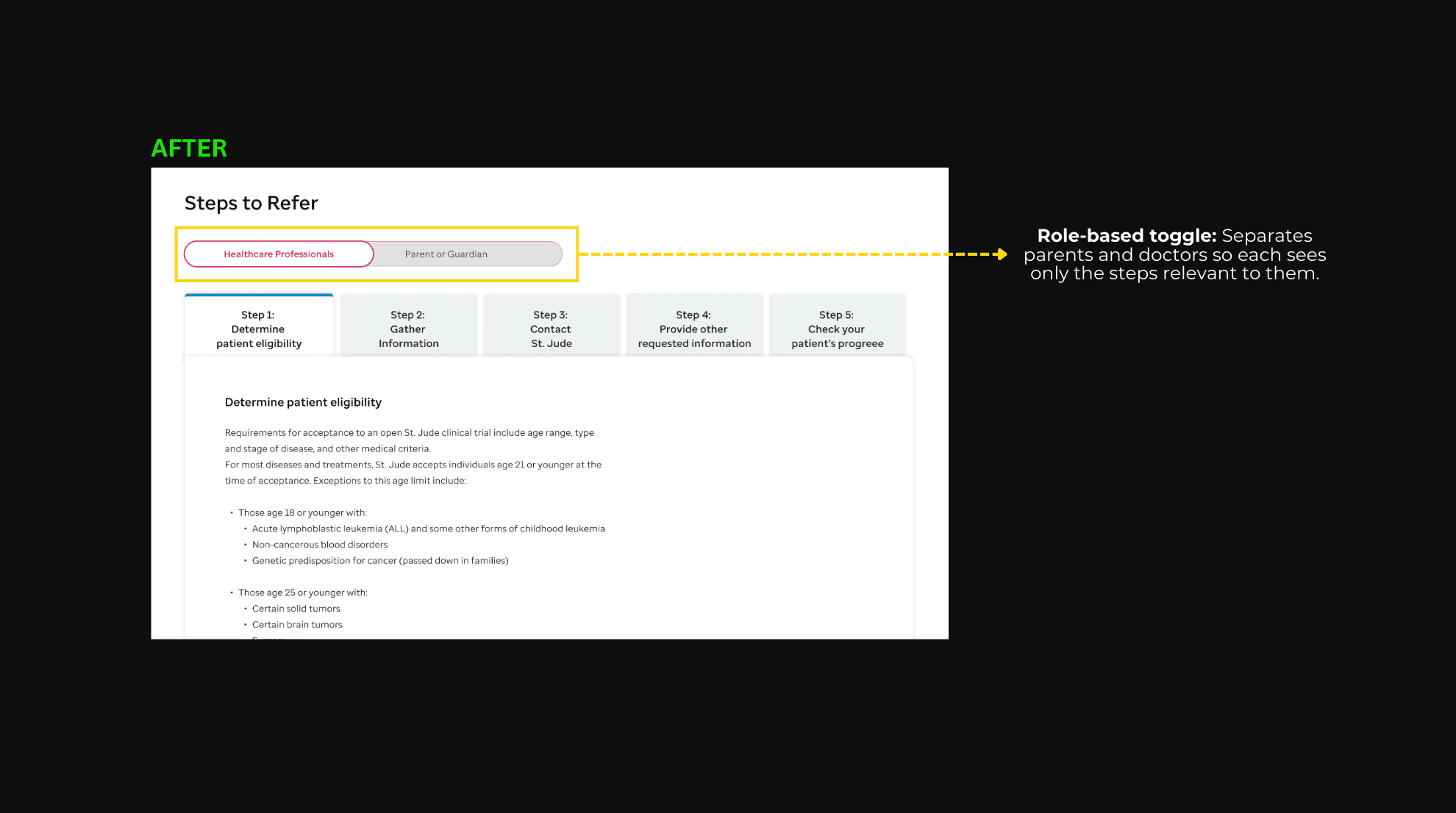
Parents struggled to find the correct referral path because of duplicate CTAs, unclear labels, and poor readability. Key information was missed, and attention was diverted by a stack of low-use red buttons.


Parents who clicked the “Refer a Patient” CTA were taken to a physician-focused page instead of a parent-friendly flow. This caused two main issues:

"The steps didn’t make sense to me… it looked like instructions for physicians, not parents."
Important eligibility information was technically present on the page, but because it lacked emphasis or visual hierarchy, many users ignored it and missed critical details.


The page displayed steps and medical details meant for doctors, which parents couldn’t follow.


In the old referral form, important instructions were easy to miss, roles were unclear, and missing features made it hard to submit. This caused parents and doctors to skip details or leave the form incomplete.

"The referral form feels scattered and unclear—I’m never sure if I’ve provided all the right information."


One big problem was the form didn’t have a document upload option, which both Parents, Healthcare workers and even the Patient Referral Office really wanted.

Stakeholders main concern was high unapproved referrals, since parents often skipped crucial details.

"Approved referral numbers are at an all-time low—we need to find a way to increase qualified submissions"
To address this, I introduced a required Clinical Trial Information field, ensuring eligibility is reviewed before submission and improving approval rates.

Good design isn’t always about creating something new—it’s about solving the right problem. Listening to users, simplifying their journey, and giving them the tools they asked for (like document upload) proved more valuable than any redesign assumption.
If I were to revisit this project, I would prioritize conducting more extensive user testing. This would help uncover deeper insights, validate design decisions, and ensure the solution aligns better with user needs.


